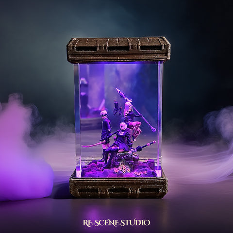
![[FATHER'S DAY] Ember Glow Ticket | $6.68 — Handcrafted Epoxy Resin LED Lamp | Unique Ambient Decor & Collector's Gift](http://rescenestudio.com/cdn/shop/files/Lucky_Star_Ticket_NYE_2026_c61361fc-ea06-4a31-8379-e16ed7d47902.jpg?v=1767177179&width=500)

How Adults Display Anime Collections Without Looking Childish
There is a thread on ResetEra that cuts right to the bone: "Do you hide your anime paraphernalia when guests come over?" Hundreds of replies. Some people admit they shove everything into closets before a date. Others say they moved their entire anime collection display into a spare bedroom so coworkers would not see it. One person described redecorating their living room the night before their parents visited, replacing every anime piece with "adult" decor from Target.
The shame is real. And it is completely unnecessary. The problem was never the collection itself.
It was the presentation. A shelf crammed with $8 prize figures, faded posters taped to walls, and a tangle of LED strips does not look childish because it is anime. It looks childish because it lacks intentional design. The exact same room, curated and lit properly, reads as a sophisticated personal gallery.
This guide is not about hiding who you are. It is about displaying your anime collection in a way that earns compliments from people who have never watched a single episode. Every principle here comes from interior design fundamentals, the same rules that galleries, boutique hotels, and high-end collectors use. Anime just happens to be the subject matter.
Why Some Anime Collections Look Childish (And Others Do Not)
Before we fix anything, we need to understand why certain setups trigger that "man-child" reaction. It is not about the content.
A framed Monet print and a framed Makoto Shinkai still both hang on walls. The difference is execution. Here are the patterns that make a collection read as immature versus intentional.
Clutter is the biggest offender. When every shelf, surface, and wall is covered with merchandise, the room feels like a store rather than a home. Your eye has nowhere to rest.
There is no hierarchy telling visitors what to look at first. Compare that to a gallery: white walls, a few carefully chosen pieces, dramatic lighting. The art commands attention because there is space around it.
The second pattern is low perceived quality. Acrylic standees, thin rubber keychains hanging from pushpins, and mass-produced wall scrolls with visible creases all signal "cheap" regardless of franchise. These items are fun to collect, but they work better stored in a display drawer or binder than spread across visible surfaces. One high-quality piece on a shelf communicates more taste than twenty small trinkets.
The third is lack of cohesion. Mixing neon Dragon Ball figures next to pastel Sailor Moon next to dark Berserk creates visual chaos.
Each piece fights for attention. Professional interior designers call this "visual noise," and it makes any room feel unfinished and disorganized. Your collection does not need a single theme, but it does need a logic that ties pieces together.
Principle 1: Curate, Do Not Hoard
This is the hardest advice for collectors, but it is the most transformative. Not everything you own needs to be on display at the same time.
Museums rotate their collections. Your favorite restaurant does not put every dish on the table simultaneously. Curation means choosing 15 to 20 standout pieces for display and keeping the rest stored safely.
Start by pulling everything off your shelves. Yes, everything. Put it all on your bed or floor. Now pick only the items that make you feel something when you hold them.
The figure that reminds you of a specific arc. The art book from your favorite film. The lamp that genuinely impresses people when they see it lit up. Everything else goes into labeled storage bins, ready to rotate in next month.
Rotating your display keeps things fresh for you and prevents visual overload for guests. Swap pieces every four to six weeks. You will rediscover items you forgot you owned, and your room will always feel intentionally designed rather than accumulated.
Principle 2: Build a Unified Color Palette
Professional rooms have a color story. Pick two to three dominant colors and build your display around them. This does not mean everything has to match exactly. It means there is a visual thread connecting your pieces.
Look at your collection and notice which colors appear most. If you own several pieces from Jujutsu Kaisen and Demon Slayer, you probably have a strong blue, purple, and red palette.
Lean into that. Choose shelving, lighting, and background colors that complement those tones. A dark wood shelf with cool blue LED accents makes those reds and purples pop without competing.
The background matters more than most people realize. A white IKEA KALLAX shelf against a white wall makes figures look like they are floating in a dentist's waiting room. But that same shelf against a dark accent wall, or with a dark felt liner on each compartment, suddenly gives every piece a gallery-worthy backdrop. This single change, adding a dark background behind your display, costs under $20 and completely transforms how the collection reads.
Principle 3: Lighting Is the Differentiator
This is where most adult collectors either excel or completely fail. Lighting is the single biggest factor separating a "cool collection" from a "childish shelf." Professional displays use intentional, layered lighting. Amateur setups rely on overhead room lights or, worse, cheap RGB strips set to rainbow cycle.
The fix is simple. Add dedicated lighting to your display area.
LED strip lights inside shelving units (set to a single warm or cool white, never rainbow) create depth and draw the eye. Puck lights aimed at specific pieces create focal points. And backlit display items, like resin lamps that produce their own glow, become natural centerpieces that anchor the entire shelf.

A piece like the Howl's Moving Castle Resin Lamp does double duty in a display. It provides its own ambient lighting while serving as a sculptural art piece.
Non-anime visitors see a beautiful, softly glowing scene from a film they probably recognize. Anime fans see a masterful tribute to Studio Ghibli craftsmanship. Both groups are impressed.
The key rule: warm white light for a cozy, gallery feel. Cool white for modern, minimalist setups.
Colored LEDs only as a subtle accent behind pieces, never as the primary light source. And please, permanently retire the rainbow cycle. It screams "gaming setup in a 14-year-old's bedroom." A fixed color, ideally matching your palette from Principle 2, looks infinitely more sophisticated.
Principle 4: Quality Over Quantity, Every Time
One $89 handcrafted resin lamp communicates more about your taste than a shelf of $8 crane game prizes. This is not about being a snob. It is about visual weight.
Higher-quality pieces have better paint jobs, more detailed sculpts, and materials that catch light naturally. They look intentional. Mass-produced trinkets look like impulse buys even when they were not.
Think about how non-collectors perceive your shelf. They do not know the characters.
They cannot tell a limited edition from a gashapon capsule toy. What they register is quality of materials, craftsmanship, and presentation. A single piece that looks like it belongs in a gallery tells visitors "this person has refined taste." Twenty small pieces crammed together tell visitors "this person buys everything."
This does not mean you should throw away affordable items you love. It means you should curate what is visible.
Keep the pieces that hold emotional value. Store the ones that only add visual noise. Over time, investing in fewer, higher-quality display pieces naturally elevates your entire setup.
Principle 5: Mixed Media Creates Depth
A collection that is only figures on shelves gets monotonous fast, no matter how good the figures are. Breaking up the visual rhythm with different types of display pieces makes the space feel more like a curated gallery and less like a store shelf.
Mix figures with framed art prints, hardcover art books standing upright, handcrafted display lamps, and small sculptural objects. Vary the heights, textures, and dimensions. A tall figure next to a short resin piece next to a leaning art book creates a natural visual flow. Every item occupies a different "layer" of the display, giving the eye a journey to follow.

The Eternal Rose Garden Resin Lamp is a good example of a piece that bridges the anime and non-anime worlds. It does not scream "anime." It reads as a delicate, handcrafted art piece. Placed alongside more explicitly anime items, it creates a tonal bridge that makes the entire display feel cohesive and mature. Guests who do not watch anime will gravitate toward it, which opens a conversation instead of creating an awkward silence.
Principle 6: Frame Your Posters Properly
This one is so simple it hurts. Nothing, absolutely nothing, ages a room down faster than posters taped or tacked directly to a wall. Tape leaves marks.
Tacks leave holes. The edges curl. And the overall effect screams "dorm room" louder than a mini fridge full of energy drinks.
A basic frame from any craft store costs $10 to $25. A custom mat board that fits your poster costs another $15. For under $40 total, you transform a $5 poster into something that looks like a professional art print.
Suddenly that Cowboy Bebop key visual is not a poster; it is a framed piece of graphic art on your wall. The content did not change. The perception completely shifted.
Go one step further: use consistent frames. Black frames for a modern look, natural wood for a warm feel. When every piece on your wall shares the same frame style, the collection reads as an intentional gallery wall. Mixed frame styles, shapes, and sizes create the same visual chaos as cluttered shelves.
Principle 7: Choose Furniture That Complements
Your display is only as sophisticated as the furniture holding it. A cheap particle board bookcase with sagging shelves undermines even the best collection. You do not need expensive designer furniture. You need furniture that looks intentional and sturdy.
Glass-front cabinets (like the IKEA Detolf or similar) are the gold standard for figure display. They protect from dust, add a layer of "gallery" separation between the viewer and the pieces, and look clean. For open shelving, solid wood or metal units in dark finishes provide a professional backdrop. Avoid wire racks, plastic bins, or shelving with visible damage.
The placement of the furniture matters too. A display shelf in the corner of a room, angled away from the entrance, looks like something you are hiding. The same shelf on a feature wall, centered and well-lit, looks like something you are proudly showcasing. Position your best display where visitors naturally look when they enter the room.
Principle 8: The "Would a Hotel Display This?" Test
Here is a simple mental model that ties all these principles together. Before placing any item on display, ask: "Could I see this in a boutique hotel lobby?" Not a children's hotel.
A design-forward boutique hotel that features local art. If the answer is yes, it belongs on display. If the answer is no, it goes into storage rotation.
A framed Studio Ghibli landscape print? Absolutely could hang in a hotel. A handcrafted resin lamp with an ocean scene glowing softly on a dark shelf?
That belongs in a high-end lounge. A body pillow leaning against the couch? That is a storage item, not a display item.

The Deep Blue Ocean Resin Lamp passes the hotel test easily. It is a conversation piece that works in any setting. Placed on a nightstand or bookshelf, it adds ambient warmth and visual intrigue without requiring any anime knowledge to appreciate. That is the power of choosing display pieces that transcend fandom.
This test is not about denying your interests. It is about recognizing that display is a subset of ownership. You can own 500 items and proudly show 20 of them in a way that impresses anyone who walks through your door. The other 480 are safe, organized, and ready for rotation.
Putting It All Together: The Before and After
Picture the "before" room. Every wall has something taped to it. Three shelves are packed edge to edge with figures of varying quality.
A tangle of colored LED strips runs along the ceiling, cycling through rainbow mode. There are acrylic standees on the desk, keychains hanging from pushpins, and a stack of manga threatening to topple off the nightstand. The room screams "I love anime," but it also whispers "I have not thought about how this looks to anyone else."
Now picture the "after" room. The same person, the same collection. But the walls have three large, consistently framed prints: a Makoto Shinkai landscape, a Cowboy Bebop key visual, and a minimalist One Piece print.
One glass-front cabinet holds eight carefully chosen figures with warm white LED strips illuminating each shelf. On the desk, a single handcrafted resin lamp glows softly. The manga is organized on a dedicated shelf with bookends. The room still says "I love anime." But now it also says "I have taste, and I am not ashamed of a single thing in this room."
The transformation did not require buying new things. It required editing. Removing the visual noise.
Adding intentional lighting. Framing what deserves to be framed. Storing what does not serve the display. And choosing a few anchor pieces that impress on craftsmanship alone, regardless of whether the viewer recognizes the franchise.
Addressing the Deeper Issue: You Do Not Owe Anyone an Apology
Let us be honest about the emotional layer here. The shame around anime collections is not really about interior design. It is about the lingering cultural stigma that animation is "for kids." That stigma is fading fast.
Studio Ghibli films win Academy Awards. Demon Slayer broke Japanese box office records. Anime conventions draw hundreds of thousands of adults.
But knowing that intellectually and feeling it when your date walks into your apartment are two different things. The design principles in this guide work because they give you confidence.
When your space looks intentional, you feel intentional. You are not hiding your collection or apologizing for it. You are presenting it in a way that reflects the same care and taste you bring to everything else in your life.
The people worth keeping in your life will respect your passions when they see you respect them too. A curated, well-lit display says "this matters to me, and I have put thought into how I share it." That earns respect from anyone worth impressing.
Frequently Asked Questions
Featured Resin Lamps
Handcrafted with care — each one unique


Every lamp we create carries a piece of our heart — a small universe of light, resin, and imagination, handcrafted in our workshop for someone across the world who shares our love for these stories.