
![[FATHER'S DAY] Ember Glow Ticket | $6.68 — Handcrafted Epoxy Resin LED Lamp | Unique Ambient Decor & Collector's Gift](http://rescenestudio.com/cdn/shop/files/Lucky_Star_Ticket_NYE_2026_c61361fc-ea06-4a31-8379-e16ed7d47902.jpg?v=1767177179&width=320)


How to Style a Bookshelf That Actually Looks Good

Bookshelf styling is the difference between a room that looks finished and a room that looks like storage. Most people fill their shelves with whatever fits, stack everything vertically, and wonder why the room still feels off. The fix is not buying more decor. It is editing what you already have and placing it with intention.
These seven rules work for any bookshelf: a built-in floor-to-ceiling unit, a floating shelf, an IKEA Kallax, or a vintage wooden bookcase. The principles are the same regardless of size or budget. You do not need a design degree. You need 30 minutes and the willingness to remove things from your shelf, which is harder than it sounds.
The biggest shift in bookshelf styling over the past few years is the move away from pure decoration toward intentional curation. In 2026, the best-looking shelves tell a story about the person who styled them. They mix practical items (the books you actually read) with meaningful objects (a souvenir, a gift, a piece of art) and functional accents (a lamp, a clock, a small tray for keys). The result feels personal rather than staged.
Rule 1: Start by Taking Everything Off the Bookshelf
This is the step most people skip, and it is the most important. You cannot style a cluttered shelf. Empty every single item onto the floor or a table. Wipe down each shelf. Now look at the empty bookcase. Notice how clean and calm it looks. Your goal is to put back only what earns its place.
Sort your items into three piles: keep, relocate, and remove. The "keep" pile should include books you actually love (not textbooks from 2014), meaningful objects, and functional items you reach for regularly. The "relocate" pile goes to other rooms. The "remove" pile goes to donation. Most people discover they only want to keep about 60% of what was on their shelves. That 40% reduction is where the magic happens.
Rule 2: Use the 60/30/10 Bookshelf Formula
Professional stylists use a ratio: 60% books, 30% decorative objects, and 10% empty space. That empty space is not wasted. It is what makes the other items visible. A shelf packed edge to edge looks heavy and cluttered even if every individual item is beautiful.
The 10% empty space acts as visual breathing room. Your eye needs places to rest. If every square inch is filled, nothing stands out. Group your books in clusters of 3 to 7 rather than one long continuous row. Between clusters, place a single decorative object or leave the space open.

Rule 3: Mix Vertical and Horizontal Book Stacks
All-vertical shelving looks like a library, not a styled display. Break up long rows of upright books with a horizontal stack of 2 to 4 books. Place something on top of the horizontal stack: a small plant, a candle, or a decorative object. This creates height variation and visual interest within each shelf section.
Horizontal stacks also serve a practical purpose. They act as risers that elevate small objects to eye level. A 3-inch ceramic pot sitting directly on the shelf can get lost. That same pot on top of two stacked books gains visibility and importance. Interior designers call this "creating levels," and it is the single easiest trick to make a shelf look styled versus stuffed.
Rule 4: Add at Least One Light Source
A bookshelf without lighting is a bookshelf that disappears at night. Adding even one small light source transforms the shelf from storage into a display. LED puck lights that stick to the underside of each shelf are the cheapest option at under $15. A small accent lamp on one of the shelves adds warmth and personality.
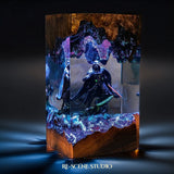
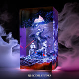
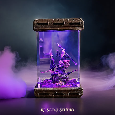
Ambient lighting is what separates a good room from a great one. A bookshelf with a warm glowing object draws the eye and anchors the room after dark. If you want something that doubles as both light and art, handcrafted pieces like the Eternal Rose Garden Lamp add organic warmth without looking like traditional lighting. The soft LED glow through resin creates the kind of ambient effect that puck lights cannot replicate.

For more on how lighting layers work in a room, see our guide on how to layer lighting like a designer.
Rule 5: Create a Color Story
You do not need to color-code your entire bookshelf (although some people love that look). But you should have a general palette. Pick 2 to 3 dominant colors and let them repeat across the shelf. If your room is neutral toned, keep the shelf mostly white, cream, wood, and green. If your room has warm accents, lean into rust, amber, and terracotta on the shelf.
Remove or relocate books with clashing spine colors. A single bright red book in a sea of muted tones will draw the eye whether you want it to or not. Turn those books around so the pages face out if you cannot relocate them. The uniform cream of page edges creates a calmer visual line than a rainbow of spines. This technique works especially well for books you want to keep but whose covers clash with your palette.
Your decorative objects should follow the same color story. A brass plant pot, a wooden frame, and a cream candle all share warm tones that work together. Mixing brass, chrome, neon, and matte black on the same shelf creates visual noise. Pick one metal finish and one wood tone, then let those repeat across the bookcase. Consistency in materials matters as much as consistency in color.
Rule 6: Use Odd Numbers When Grouping
Groups of three or five look more intentional than groups of two or four. This is called the "rule of odds" and it applies to every form of visual composition, from photography to interior design. Three small objects grouped together create a focal point. Two of the same objects look like you just happened to own two. Five creates a sense of abundance without chaos.
When placing objects, vary the height within each group. A tall vase next to a medium-height candle next to a small succulent creates a visual triangle that the eye follows naturally. All three items at the same height looks flat and unintentional. The height variation is what makes a group look curated rather than coincidental.

Rule 7: Edit Ruthlessly Every Season
A styled bookshelf is not a "set it and forget it" project. Every 3 to 4 months, revisit the shelf. Remove items that no longer feel right. Swap in something new: a postcard from a recent trip, a new book, a seasonal plant. This rotation keeps the shelf feeling alive rather than frozen in time.
Seasonal editing also prevents the gradual creep of clutter. Without regular editing, shelves slowly accumulate random items (an old receipt, a charger cable, a mug that never made it back to the kitchen) that erode the curated look you worked to create. Set a calendar reminder if you need to. The 30 minutes it takes to re-edit a bookshelf is one of the highest-ROI home improvement tasks you can do.
A good seasonal rotation cycle: spring gets fresh greenery and lighter colors. Summer gets travel souvenirs and bright accents. Fall leans into warm tones, dried flowers, and candles. Winter adds metallic accents and cozy textures. You are not redecorating the entire shelf each time. Swapping just 2 to 3 items per season keeps the display feeling current without requiring a full restart.
Bookshelf Styling by Room Type
The room changes the rules slightly. In a living room, the bookshelf is a focal point. Style it for visual impact with your best objects at eye level and books arranged in color-coordinated clusters. In a home office, prioritize function: reference books within arm's reach, supplies in decorative boxes, and a task lamp on one shelf.

In a bedroom, keep the bookshelf calming. Fewer objects, softer colors, and warm ambient light create a space that supports relaxation. Avoid displaying anything that feels like work (planners, laptops, charging stations) on a bedroom bookshelf. A small accent lamp with a warm glow is the single best addition to a bedroom shelf since it doubles as a night light.
For small apartments where the bookshelf serves multiple purposes (storage, display, and room divider), use the lower shelves for functional storage with baskets or boxes, and reserve the upper shelves at eye level for styled display items. This approach gives you both utility and aesthetics without sacrificing either.
Bookshelf Styling Comparison: Common Mistakes vs. Fixes
| Common Mistake | Why It Looks Wrong | The Fix |
|---|---|---|
| All books vertical, no objects | Looks like storage, not display | Add horizontal stacks + decorative objects |
| Every inch filled | No visual breathing room | Apply 60/30/10 ratio, remove 30% |
| No lighting | Shelf disappears at night | Add LED pucks or a small accent lamp |
| Random color mix | No cohesion, feels chaotic | Pick 2-3 dominant colors, relocate clashers |
| Same height everything | Flat, unintentional look | Use risers, vary object heights |
| Never editing | Gradual clutter creep | Re-style every 3-4 months |
If your room has a broader lighting issue beyond the bookshelf, our guide on 5 lighting mistakes that make any room look cheap covers the most common fixes.
Frequently Asked Questions
Featured Resin Lamps
Handcrafted with care — each one unique


Every lamp we create carries a piece of our heart — a small universe of light, resin, and imagination, handcrafted in our workshop for someone across the world who shares our love for these stories.